
Popup Embed
The Popup method is the most popular way to add a chatbot to a website. It places a "call to action" icon (usually in the bottom right corner) that users can click to expand the chat.
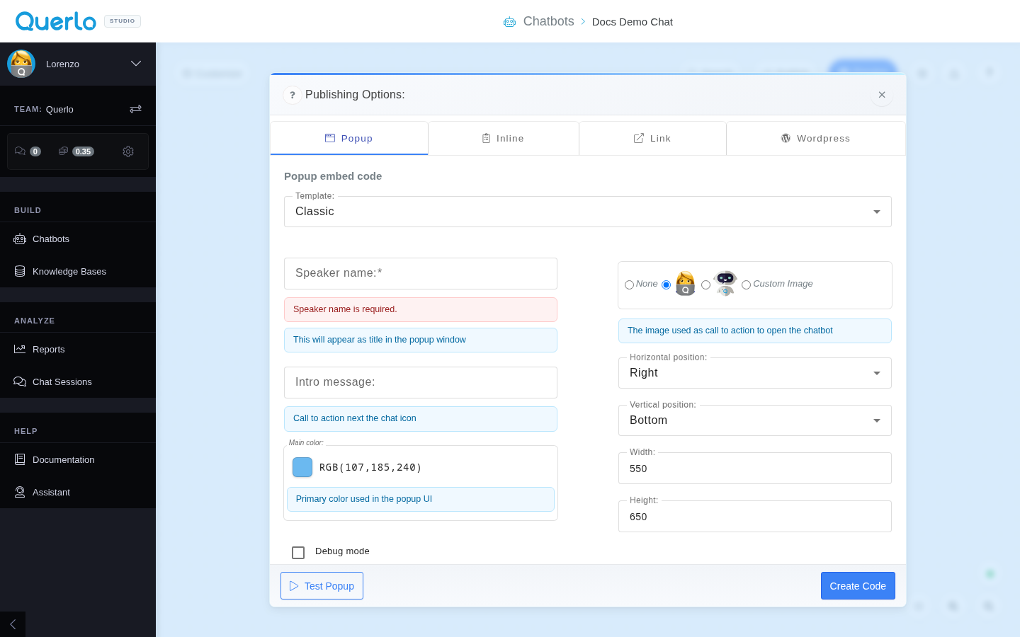
Configuration Options
When you select the Popup tab in the Publishing Options modal, you can customize the following:
- Template: Select the visual template layout (e.g., Classic).
- Speaker name: Enter the title that will be displayed in the popup window header (e.g., "Lorenzo" or "Support Bot").
- Intro message: Define a short welcome text that appears next to the chatbot launcher icon to attract user attention.
- Main color: Choose the primary theme accent color for the chat widget.
- Debug mode: Enable this checkbox to turn on debug logging for debugging integration issues.
- Avatar: Choose which avatar image to show (None, default, or Custom Image).
- Horizontal & Vertical Position: Choose where the launcher icon is positioned on the screen (e.g., Right / Bottom).
- Width & Height: Define the dimensions of the expanded popup window (default is
550x650).
Generating the Code
- Click Test Popup to preview the widget in real-time on your screen.
- Click Create Code to generate the standard integration code snippet.
Installation: Copy and paste the generated snippet into your website's HTML, typically just before the closing </body> tag on every page where you want the chatbot widget to load.